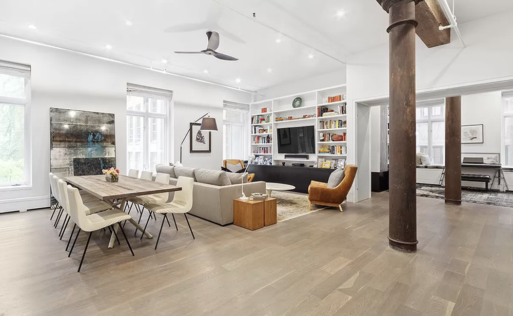
Manhattan studio apartments average just 550 square feet. One-bedroom units rarely exceed 750 square feet. These tight quarters demand smart design choices to prevent the space from feeling cramped and claustrophobic. Paint color represents the single most powerful tool for transforming how small spaces feel without knocking down walls or expanding square footage.
“Small really is the Manhattan norm: U.S. Census Bureau data shows the average household in New York County (Manhattan) is about 2 people, the kind of compact living that makes every square foot – and every paint decision – count.”
— U.S. Census Bureau, QuickFacts
The right paint colors for small apartments create visual expansion that tricks the eye into perceiving more room than actually exists. Professional painters understand the science behind color psychology and light reflection. These five proven strategies deliver maximum spatial impact in compact NYC apartments.
[The same small room, painted two ways – how color choices flip it from cramped to open.]
Strategy 1: Master Light-Reflecting Paint Colors
Light colors fundamentally transform small spaces by reflecting natural light throughout the room. Off-white, warm creams, and soft taupes maximize light reflection and visual flow in compact living areas. These shades make walls recede visually, creating the illusion of a larger area.
Using light-reflecting paint colors enhances the size of a room and brightens up dark or shadowy areas, producing a balanced and harmonious feel overall. Light colors, particularly shades of white, can easily open up a small space and make it seem much bigger by reflecting light and making the walls recede.
“The ‘light makes rooms feel bigger’ idea has measurable physics behind it. The U.S. Department of Energy notes that light-colored walls, ceilings, and floors reflect light and can reduce the amount of artificial lighting a room needs – the same reflectance that makes a small apartment read brighter and more open.”
— U.S. Department of Energy
Benjamin Moore offers exceptional options for small spaces. Their Simply White and Decorator’s White provide crisp, clean backdrops that amplify natural light without feeling stark or clinical. Sherwin-Williams Alabaster and Greek Villa deliver similar expansion effects with subtle warmth that prevents the sterile feeling some pure whites create.
The finish matters as much as the color itself. Satin or eggshell finishes help bounce ambient light across a small apartment more effectively than flat paint. These sheens reflect light at gentle angles, creating soft illumination that makes rooms feel airier without the harsh glare of semi-gloss.
According to Benjamin Moore color experts, pale and pastel colors, especially when painted above eye level, create an airy effect that can visually heighten walls. This technique makes small spaces feel larger and more open than darker alternatives.
Strategy 2: Apply the Ceiling Color Trick
Painting the ceiling in a lighter color than the walls creates the illusion of height, making the room feel taller and more spacious. This simple technique delivers dramatic impact in small rooms with standard eight-foot ceilings common throughout Manhattan apartments.
A monochromatic color scheme, where walls, ceilings, and trim are painted in varying shades of the same color, can elongate the appearance of walls and create a cohesive look that enhances the sense of space. Using variations of one color minimizes visual clutter that shrinks perceived room size.
For maximum height effect, paint ceilings two to three shades lighter than the walls. This subtle contrast draws the eye upward naturally, making the ceiling appear to float higher above the living space. The technique works particularly well in small bedrooms and bathrooms where vertical space feels especially constrained.
Some designers push this strategy further by extending light ceiling paint slightly down the walls. This “wrapped ceiling” approach blurs the boundary where walls meet the ceiling, creating ambiguity about the room’s actual height. The brain interprets this ambiguity as additional vertical space.
Strategy 3: Harness Vertical Stripes for Height
Using vertical stripes on walls draws the eye upwards, creating an instant feeling of height in a room. This classic design principle transforms low-ceilinged spaces into rooms that feel significantly taller than their actual dimensions.
Vertical stripes work through directional emphasis. The human eye naturally follows linear patterns. When those lines run floor to ceiling, vision travels upward repeatedly, reinforcing the perception of substantial vertical space. The effect becomes particularly powerful in narrow hallways and small bathrooms.
Paint vertical stripes in two shades of the same paint color for sophisticated results. High contrast stripes (like navy and white) create dramatic statements but risk overwhelming tiny rooms. Subtle variations within the same color family deliver height benefits without visual chaos.
Professional application matters significantly with striped patterns. Precise taping, consistent width, and clean edges separate amateur attempts from polished results. Many Manhattan homeowners hire professional painters specifically for stripe work to ensure the technique enhances rather than detracts from their small space.
[The five space-expanding strategies at a glance, and the trick each one plays on the eye.]
Strategy 4: Deploy Strategic Accent Walls
A painted accent wall adds a focal point to any room, enhancing architectural interest in smaller spaces. Using an accent wall allows for a bold color choice without overwhelming the entire room, making it a popular design strategy in small spaces.
Accent walls can be used to draw attention to specific features in a room, such as windows or artwork, enhancing the overall design. This focused color application creates depth and dimension that makes the room feel larger rather than smaller.
The secret lies in placement and color selection. Choose the wall furthest from the entry point for accent treatment. This positioning draws the eye across the room’s full depth, emphasizing distance rather than highlighting confinement. Walls behind beds in small bedrooms or the wall opposite bathroom doors work particularly well.
Bold colors shine on accent walls where they add drama without overwhelming the space. Rich blues create a sense of depth, making the wall appear further away than it actually is. Deep forest greens produce similar effects while adding sophisticated warmth to compact living rooms.
The 80/20 rule guides successful accent wall execution. Make 80% of the room a light color and use 20% for contrasting deeper accents to add depth without shrinking the space. This balance maintains openness while introducing personality and visual interest.
Strategy 5: Embrace Dark Colors Strategically
Dark colors blur room corners to create an illusion of endless space. This counterintuitive strategy works by eliminating visual boundaries that define confined areas. When executed properly, dark paint actually expands perceived room size rather than contracting it.
Using rich blues or deep forest greens can create a sense of depth in small spaces, making the walls appear further away than they actually are. Darker colors, when used throughout a small room, can create a cozy and inviting atmosphere, countering the common belief that they make spaces feel smaller.
Surprising fact
“Here’s the counterintuitive part most people get wrong: a deep charcoal or navy can make a tiny room feel bigger than a pale gray. Dark walls hide the corners where surfaces meet, so the eye loses track of exactly where the room ends – and the brain tends to guess ‘larger’ rather than ‘smaller.'”
The technique succeeds by manipulating light and shadow. Dark walls absorb light, softening the hard edges where walls meet. Without clear corner definition, the brain cannot accurately judge room dimensions. This uncertainty typically resolves toward assumptions of larger rather than smaller space.
Cool tones have shorter wavelengths and trick the brain into perceiving walls as further away. Navy blues, charcoal grays, and deep teals leverage this optical phenomenon. These shades work especially well in small bathrooms and bedrooms where cozy sophistication enhances rather than undermines the intended atmosphere.
Incorporating dark colors in small spaces enhances visual interest and depth, especially when combined with lighter accents or textures. Pair dark walls with white trim, light furniture, and bright artwork to maintain balance. The contrast between dark and light creates dynamic energy that makes rooms feel intentionally designed rather than accidentally cramped.
Choosing Your Small Space Color Palette
Building an effective color palette for a small apartment requires understanding how colors interact with natural light, existing furniture, and architectural features. The goal remains consistent: maximize perceived space while creating a home that reflects personal style.
Start by assessing the natural light in your space. Rooms with large windows facing south receive abundant sunshine throughout the day. These spaces handle bolder color choices well because bright light prevents colors from appearing too heavy. North-facing rooms receive cooler, dimmer light that intensifies paint colors. These spaces benefit most from light-reflecting shades.
Consider your existing furniture carefully. A bold hue on the walls creates the perfect backdrop for neutral furnishings, allowing statement pieces to shine without overwhelming the eye. Conversely, colorful furniture looks best against neutral walls that provide visual breathing room.
According to Homes & Gardens interior design experts, almost-cream yellows are making a comeback in 2026 for their ability to add warmth without shrinking spaces. These undertones bring personality while maintaining the light-reflecting properties crucial for small apartments.
Paint Finish Selection for Small Rooms
The paint finish dramatically affects how color performs in small spaces. Sheen determines light reflection, durability, and overall aesthetic impact. Manhattan apartments demand finishes that balance visual expansion with practical wear resistance.
Flat paint minimizes light reflection, making it ideal for ceilings where you want color without sheen. However, flat finishes show every imperfection and clean poorly, making them problematic for high-traffic areas in compact apartments.
Eggshell finishes strike the optimal balance for small apartment walls. They reflect enough light to open up space without creating the harsh glare that makes rooms feel smaller. The subtle sheen adds depth and dimension while remaining practical for cleaning the inevitable marks that accumulate in tight quarters.
Satin finishes work beautifully in small bathrooms and kitchens where moisture resistance matters. The increased sheen bounces light effectively, making cramped spaces feel more open. Test samples in your actual lighting conditions before committing. Paint colors shift dramatically between paint chips, samples on walls, and full room application.
Common Paint Mistakes That Shrink Small Apartments
Understanding what not to do proves as valuable as knowing proper techniques. Several common painting mistakes make small NYC apartments feel even more cramped than necessary.
[The habits that open a small space up versus the ones that quietly shrink it.]
Using too many colors fragments small spaces visually, creating busy chaos that emphasizes confinement. Stick to a maximum of three colors throughout the entire apartment. Consistent color choice from room to room allows the eye to flow smoothly through the space, creating a sense of continuity that makes the entire apartment feel larger.
Painting only three walls in a color while leaving the fourth white disrupts visual flow and highlights the room’s small dimensions. Complete rooms in consistent color for maximum expansion effect. If accent walls appeal to you, execute them properly with complementary colors rather than random leftover paint.
Choosing high-contrast trim creates harsh boundaries that emphasize where small rooms end. Paint trim in the same color as walls, or opt for just slightly lighter shades. This approach blurs edges and extends perceived wall space beyond actual boundaries.
Stopping paint at door frames breaks visual continuity between rooms. Extend the same color through doorways and hallways to create a flow that makes the entire apartment feel more open. Small apartments benefit tremendously from this connected color strategy.
Professional Paint Application in Small Spaces
Quality application matters enormously in small apartments where every square inch counts. Poor paint jobs with visible brush marks, uneven coverage, or sloppy edges draw attention to imperfections that emphasize limited space.
Professional painters understand the technical requirements of small space painting. They prepare surfaces meticulously, ensuring walls remain smooth and uniform. Proper prep work includes filling nail holes, repairing cracks, and sanding rough areas before any paint touches the walls.
Working in confined Manhattan apartments demands experience with tight quarters. Professional crews protect furniture efficiently, work around residents’ schedules, and complete jobs quickly without sacrificing quality. They understand building regulations, elevator restrictions, and the logistics that make NYC painting projects unique.
The interior painting services at Mint Paint & Floor specialize in maximizing small apartment potential through strategic color selection and flawless application. The team helps clients navigate the overwhelming array of paint choices to identify options that deliver the desired spatial impact.
Color Psychology in Compact Living
Beyond the physical properties of light reflection and visual tricks, paint colors affect mood and perception in ways that influence how small spaces feel emotionally. Creating a home that feels comfortable rather than claustrophobic requires attention to psychological impact.
Cool blues and greens create a sense of calm and openness. These colors recede visually, making walls appear further away while simultaneously reducing stress and promoting relaxation. Small bedrooms benefit particularly from these peaceful shades.
Warm neutrals like beige, taupe, and warm gray create a cozy atmosphere without the shrinking effect of darker colors. They provide a perfect backdrop for adding personality through artwork, textiles, and furniture while maintaining the open feeling small apartments require.
Introducing personality through bold accent walls or colorful accessories allows small apartment dwellers to express style without sacrificing spatial expansion. Balance remains key. One dramatic feature wall creates interest. Multiple competing colors create chaos that emphasizes limited square footage.
Testing Paint Before Committing
Never select paint colors based solely on small chips or online swatches. Colors change dramatically depending on lighting, surrounding surfaces, and room size. Testing properly prevents expensive mistakes that make small apartments feel smaller.
Purchase sample sizes of your top color choices. Paint large swatches on different walls to see how natural light affects the shade throughout the day. Morning light differs dramatically from afternoon sun and evening artificial lighting.
Live with samples for at least three full days before making final decisions. Initial reactions often change as you experience the color in various lighting conditions and moods. What felt perfect immediately might reveal problems after you’ve spent time in the space.
Consider how colors work with your existing furniture, artwork, and personal items. Paint represents just one element in your overall design. The color must complement everything else in your small apartment to create a cohesive look that enhances the sense of space.
Working With Manhattan’s Unique Lighting
Manhattan apartments face unique lighting challenges that affect paint color selection. Buildings create shadows, neighboring structures block sunlight, and street-level units receive minimal natural light. These factors demand careful color consideration.
[Where your apartment sits in the building changes the light it gets – and the colors that work in it.]
Apartments facing north receive cool, indirect light that intensifies paint colors. Choose lighter shades than initially seem necessary. What looks perfect in the paint store may appear several shades darker on north-facing walls.
Street-level apartments with limited natural light benefit most from the lightest possible paint colors. Off-white shades maximize whatever light enters the space, creating an airy feel despite compromised natural lighting conditions.
High-floor apartments with abundant natural light handle bolder color choices well. Bright sunlight neutralizes the intensity of darker shades, allowing for creative color use without overwhelming small spaces.
Coordinating Trim, Doors, and Ceiling Colors
Creating maximum spatial impact in small apartments requires coordinating all painted surfaces. Trim, doors, and ceilings contribute significantly to the overall perception of space. Strategic color coordination amplifies the expansion effect.
Painting trim the same color as the walls eliminates visual barriers that fragment small rooms. This monochromatic approach creates seamless continuity that makes walls appear to extend beyond their actual boundaries. The technique works particularly well with light-reflecting shades.
Doors painted to match walls disappear visually, reducing visual clutter in small spaces. This approach proves especially effective in studios where multiple doors (bathroom, closets, entry) can dominate wall space if painted in contrasting colors.
White ceilings remain the standard choice for small apartments. The bright, light-reflecting surface maximizes height perception and amplifies natural light. However, painting ceilings slightly lighter than walls in the same color family creates subtle sophistication that works beautifully in contemporary spaces.
Beyond Paint: Complementary Design Elements
While paint colors provide the foundation for making small apartments feel larger, complementary design elements reinforce and amplify the effect. Professional designers understand how to layer multiple strategies for maximum impact.
Mirrors strategically placed opposite windows double natural light and create the illusion of additional space. Large mirrors effectively extend rooms visually, making them feel significantly more open.
Consistent flooring throughout the apartment creates visual continuity that makes the entire space feel larger. Changing flooring materials between rooms fragments small apartments, emphasizing their compact size.
Furniture selection matters enormously in small spaces. Choose pieces proportional to room size, favor items with exposed legs that create visual breathing room, and keep pathways clear to maintain flow. Well-chosen furniture enhances the expansion effect of properly selected paint colors.
Making Your Decision
Transforming a small NYC apartment through strategic paint selection requires understanding color theory, light physics, and visual psychology. These five proven strategies deliver measurable results that make compact spaces feel significantly more open and inviting.
“Forget the old rule that small rooms must be white. The real rule is simpler: small rooms must be intentional. A confident, well-applied color scheme beats a timid all-white box every time — in a tight Manhattan apartment, indecision reads as cramped.”
The investment in professional color consultation and expert application pays dividends daily. Living in a thoughtfully painted small apartment feels dramatically different from occupying a poorly colored, cramped space. The difference affects mood, stress levels, and overall quality of life.
Mint Paint & Floor brings extensive experience helping Manhattan residents maximize their small apartment potential through expert color selection and flawless application. The team understands the unique challenges of NYC apartments and provides guidance that delivers results worth celebrating.
“Premium paint, floor and renovation services that deliver quality, communication and care.”
— the standard behind Mint Paint & Floor, founded by lifelong NYC craftsman Mike, with a team bringing over 100 years of combined experience across Manhattan, Brooklyn, and Long Island.
Ready to transform your small Manhattan apartment into a space that feels open, bright, and welcoming? Book a professional color consultation with the team. Explore the gallery of completed projects to see how strategic paint choices transform compact NYC apartments into beautiful homes.