Choosing paint color combinations sounds simple until you are standing in front of a wall of paint chips wondering why every white suddenly looks gray and every gray looks blue. In New York City homes, where natural lighting varies wildly and architecture ranges from historic brick townhouses to modern condos, color choices matter a lot.
The right color scheme can make a space feel larger, brighter, and more comfortable. The wrong one can feel flat, dark, or disconnected. That is why professional painters and designers approach color differently. At Mint Paint & Floor, color selection is not guesswork. It is a process built on experience, attention to detail, and a deep understanding of how color behaves in real homes.
This guide breaks down proven paint color combinations, including exterior brick and paint color combinations, and shows you how professionals create a cohesive look that holds up over time.
Why Paint Color Combinations Matter More Than You Think
Paint is one of the most powerful design elements in any home. It affects how big a room feels, how light moves through a space, and how different elements work together.
In NYC homes especially, color choices need to account for:
- Limited or uneven natural lighting
- Existing materials like brick, stone, flooring, and millwork
- Tight spaces that need visual balance
- Long-term value and resale appeal
A good combination is not about picking one color you love. It is about building a palette that works as a whole. Walls, trim, doors, and accents all need to support each other. When that balance is right, the result feels intentional and calm.
How Professional Painters Choose Paint Color Combinations That Work
Experienced painters and designers do not rely on trends alone. They rely on systems. Here is how expert advice turns a pile of paint samples into a cohesive color scheme.
They Start With Light
Natural lighting changes everything. A color that looks warm in a sunny Brooklyn living room may feel cold in a shaded Manhattan apartment. Professionals test colors on walls at different times of day to see how they really behave.
They Think in Color Families
Using related color families creates harmony. Even when mixing bold or contrasting colors, keeping undertones aligned helps the palette stand as one.
They Use the Color Wheel
The color wheel is not just theory. It helps identify complementary colors, subtle contrast, and safe ways to mix and match tones without clashing.
They Build From Existing Elements
Brick, stone, cabinetry, flooring, and trim all influence the final look. The goal is not to fight those elements, but to pair colors that support them.
4 Color Combinations Designers and Painters Trust
These four color combinations are reliable, flexible, and widely used by designers because they work across a range of homes and styles.
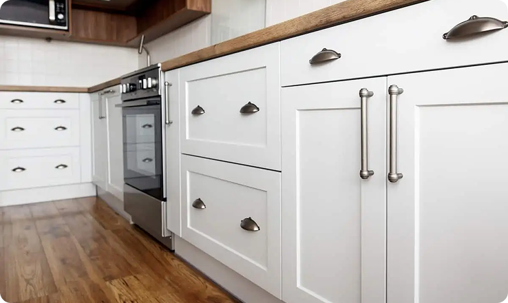
1. Warm White, Soft Gray, Natural Wood, Matte Black
This is a classic combination that works beautifully in prewar apartments and townhomes.
- Warm white walls keep the space bright and comfortable
- Soft gray trim adds definition without harsh contrast
- Natural wood brings warmth and texture
- Matte black accents add depth and structure
This palette feels clean but not sterile. It pairs well with both modern and traditional furnishings and adapts easily to changing taste.
2. Greige, Crisp White, Charcoal, Muted Blue
Greige sits between beige and gray, making it one of the most flexible colors available.
- Greige walls adapt to different lighting conditions
- Crisp white trim keeps lines sharp
- Charcoal adds contrast without going fully bold
- Muted blue adds color without overpowering the space
This combination is popular in renovated condos and open layouts where flow matters.
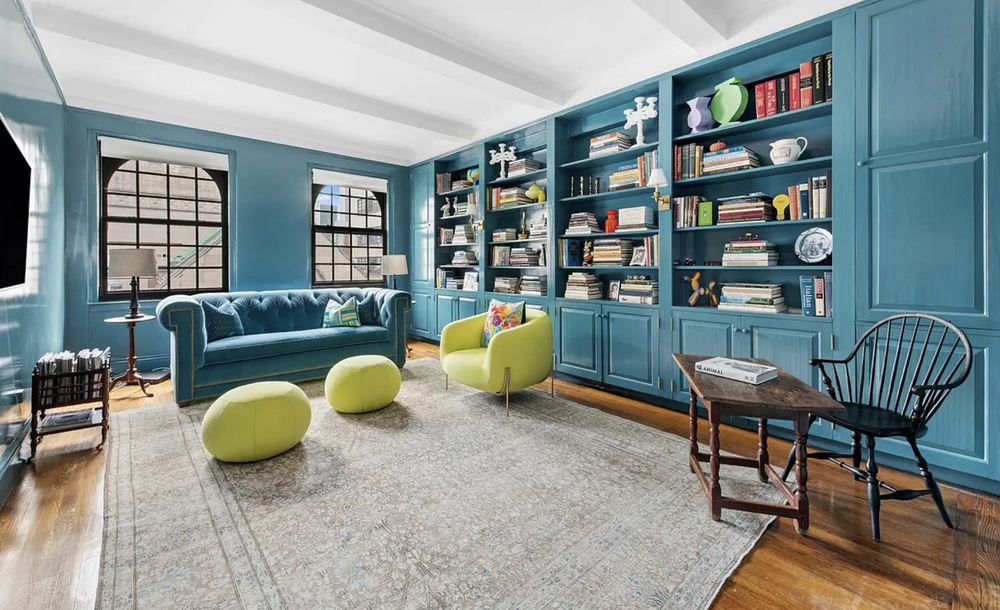
3. Creamy Neutral, Sage Green, Taupe, Brushed Brass
This palette leans calm and natural, ideal for bedrooms and living spaces.
- Creamy neutral walls feel soft and inviting
- Sage green adds subtle color tied to nature
- Taupe grounds the palette
- Brass accents bring warmth and elegance
It is a great choice for homeowners who want color but still want a timeless look.
4. Soft Beige, Warm White, Clay or Sand, Deep Brown
This combination works well in homes with good light and natural materials.
- Soft beige walls create a warm base
- Warm white trim keeps things fresh
- Clay or sand tones add personality
- Deep brown anchors the palette
This palette is especially effective when paired with stone, wood, or textured finishes.
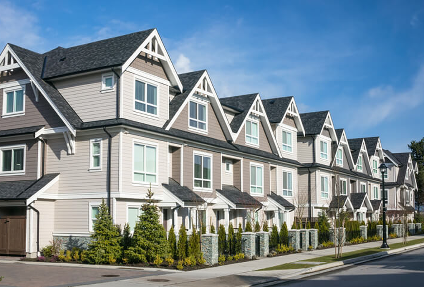
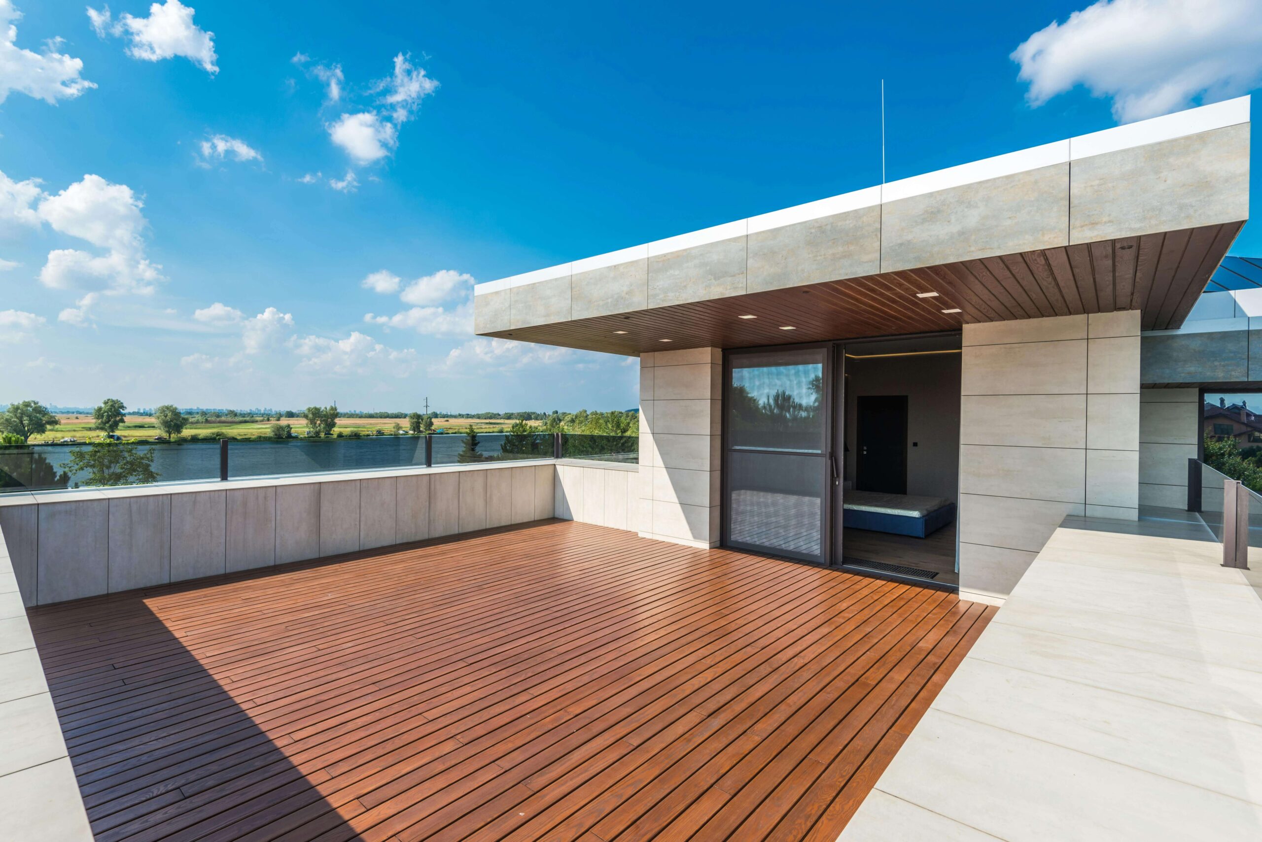
Exterior Brick and Paint Color Combinations That Elevate Curb Appeal
Exterior paint is about more than color. It is about proportion, contrast, and durability. Brick homes in NYC benefit from thoughtful paint choices that respect the material.
Red Brick, Soft White Trim, Black Door
A true classic.
- Brick stays natural
- Soft white trim highlights architectural details
- A black front door adds contrast and authority
This combination stands the test of time and works across many neighborhoods.
Limewashed Brick, Warm Gray Trim
Limewash allows brick to breathe while softening its appearance.
- Brick texture remains visible
- Warm gray trim adds subtle contrast
- The overall look feels natural and refined
This is ideal for older masonry homes.
Dark Brick, Cream Trim, Bronze or Copper Accents
For a more dramatic look:
- Dark brick creates depth
- Cream trim softens contrast
- Bronze or copper elements add warmth and interest
This palette pairs well with bold doors and classic shutters.
Common Mistakes Homeowners Make With Paint Color Combinations
Even with good intentions, many homeowners run into the same issues.
- Choosing colors in isolation instead of as a palette
- Ignoring how lighting changes throughout the day
- Forgetting about trim, doors, and ceilings
- Picking bold colors without balancing contrast
- Skipping sample tests before committing
Paint is forgiving, but time and labor are not. Professional guidance helps avoid costly repainting.
Why Professional Painting Makes the Difference
A professional painting company does more than apply paint. They manage the entire color process.
At Mint Paint & Floor, that means:
- Helping clients choose colors that fit their space and taste
- Testing combinations on site
- Protecting floors, furniture, and finishes
- Applying paint with precision so lines, trim, and surfaces look clean
- Clear communication from start to finish
With over 100 years of combined experience, the team understands how small details affect the final look.
How Mint Paint & Floor Helps NYC Homeowners Choose the Right Colors
Every home is different. A Manhattan apartment has different needs than a Long Island home or a brick townhouse.
Mint Paint & Floor helps homeowners:
- Explore color collections without feeling overwhelmed
- Find a palette that works with their home’s existing elements
- Create a cohesive look across rooms
- Choose finishes that feel comfortable and intentional
From interior painting to exterior brick, siding, trim, doors, and shutters, every surface is considered as part of the whole.
Ready to Create a Home You Love
Paint color combinations have the power to transform how your home looks and feels. When chosen carefully, they bring balance, contrast, and meaning to a space. When applied by experienced professionals, they last.
Mint Paint & Floor is proud to serve Manhattan, New York City, Brooklyn, Queens, Long Island, and surrounding areas with unmatched care and craftsmanship. If you are ready to discover what expert painting can do for your home, now is the time to start.
Sometimes the right color choice is not about trends. It is about creating a space that feels right the moment you walk through the door.